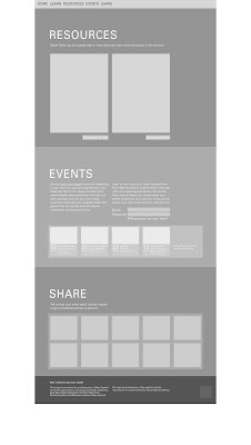
-having a nav bar at the top is simpler?
-the background of the home page here will be an image similar to the poster - probably the lego person doing something different.
-these have white space on either side for background - but may consider extending the sections across the whole width?
-i arranged the information a little differently


No comments:
Post a Comment